
*** THIS WEBPAGE IS STILL UNDER CONSTRUCTION. ***
No idea when I'll have time for updates and additions.
Welcome to the Simulated Creations Repainting 101!
This will be a short set of lessons for the standard techniques I use. Everyone has their own way of doing things, and learns some new trick every day, so I'm just going to focus on what I do using the software that I use. Hopefully the tools I use and their titles will translate over to the software that you are using. There are plenty of excellent repainters, and repaint tutorials out there to find. Do your online research if you are really interested in getting into this mind-twisting obsessive hobby.
My goal here is to help new repainters get up-and-running very quickly with some important information that I learned through trials and tribulations over decades. Some of this may be covered in other tutorials, or maybe it isn't. I don't know...
Honestly, I haven't spent any real time reading other repaint tutorials. I haven't spent any time looking at others' work. I haven't gotten into the repainting forums to find out what others use for software or what their techiques are. I haven't even looked at what repaints others have done for particular aircraft. I think I may have stepped on some toes over the years because of this, but I do my own repainting in my own bubble. And this tuturial is just me sharing my way of doing things with the software I use, plain and simple. Some of this may be new to you, and some of it may be old methods others have used.
I have come up with my own techniques for some harrowing issues that have caused me tons of headaches and wondering how to tackle them. I want to pass this knowledge onto others and help the Flight Sim world, as many in the Flight Sim world have helped me. I just do my own thing and this tutorial will show you what happens in my bubble. Hopefully, much of what I show here is off the beaten path. That's the path I take. Have fun!
A2A Simulation's Repainters Forum is found here: https://a2asimulations.com/forum/viewforum.php?f=98.
*** From the outset I want to be clear about something. This is about repainting aircraft - about revamping previous works that others have done. This is much like the music world when a band comes out with a new version of an old song. The new version might be better to many ears, but the true honor goes to those who wrote the song from scratch in the first place. It is easy to improve on others' pixels when they have done all the work, and I will always honor the original artists who started with a blank slate. I salute them!
'Nuf said...
Learn to Crawl Before You Can Walk.
The first step is to find a graphics editing program that is capable of some basic functions:
1: It must be capable of using LAYERS. While this is not the most basic of functions, it IS paramount to both simplyfing your work, and also allowing you to perform actions that are not possible without creating Layers. If your software can create Layers, it should also be capable of DUPLICATING that layer, and changing the OPACITY of that Layer after it is created.
2: If your software of choice can create Layers, then it should be able to create various types of Vector Lines, Drop Shadowing, and have a variety of paint brush textures and shaping.
3: Most of the digital-graphics-world uses Photoshop, which uses files with extension PSD. Even if you don't use Photoshop as your primary graphics software, you will need a program that can open Photoshop PSD files since most manufacturers' paint kits are of this type.
4: Rotation of images is also important. Your software should have the ability to rotate single layers in 10ths or 100ths of a degree to get things just right. Stenciling often follows the lines of a wing or fuselage at random angles, so you'll need to rotate text to match these angles.
5: You need the capabilty to grab fonts from your Operation System (Windows, Apple, etc) and be able to use them with a Text/Font feature within your graphics software. You will need the ability to create fonts as Vector, so that you can play around with it after laying down a font that is similar but different than what you want. This saves time.
"DXTBmp" is a standard program for opening DDS files. It is able to team up with your favorite graphics software and use a 2-step process for editing graphics. First, you double-click any DDS file, and choose DXTBmp to open it. Within DXTBmp you click the "Prefs" menu item, then "Select Editor". Then you find the EXE file for your preferred graphics software, and you are now set up for a streamlined process of editing your aircraft files.
Some programs are able to work with DDS files in a one-step process. That's awesome! But I'm an old dog and I use my system that I use. I'm not suggesting that everyone does things my way. Find what works best for you.
Download "DXTBmp" here: http://www.mwgfx.co.uk/programs/dxtbmp.htm.
SOME TERMS:
RASTER & VECTOR: In a graphics file there are two ways of creating colored pixels that you see on your computer screen. One is to actually change the "physical" pixel itself. Raster graphics is kind of a physical manipulation of the pixels that make up a graphics file. Each pixel in a raster layer has an RGB number assignment. Think of Raster layers as the actual canvas you are painting.
Vectors are a mathematical algorithm, or projection, that tells a file to place visual effects into a graphics file. With Vector graphics, the pixels are not changed in the base Raster file, but another layer is created with digital data to project visual graphics. Vector graphics MUST exist on another layer than Raster graphics. They are two different technologies and cannot exist on the same layer together. Think of a Vector layer as a projector putting an image on a movie screen. The screen is not painted like a canvas, but has an image shining on it. Vectors are kind of like that.
Let's look at it another way. Take two different types of files on your computer that you would print out on your printer. One is a photo that is probably a JPG or BMP file. The other is a TXT or DOC file. The photo will be a Raster Graphics file. It is made up of pixels in a single-layer graphics file. The document, on the other hand, will be a heap of digial data that tells the printer what to put onto a piece of paper, but there are no pixels (until the print job is temporarily converted to a raster PDF file for the printer to eat.)
In a multi-layered graphics file, a Raster Layer will be made of pixels. A Vector Layer will be made of data just like a text document. Raster graphics with pixels will increase the size of a file dramatically, while simple data in Vector graphics will not. On your computer, look at the size of photo files compared to text document files and you will see that photos are much larger files. You can look up these terms in Wikipedia for further explanation if my ramblings don't make sense.
BUMPMAP: These are "maps" to tell FSX how to catch light from the virtual sun across the surface of a 3D computer model. This is not particular to FSX and all games use them. In FSX Bumpmaps will use a hue of blue that is about the same as the clear blue sky in FSX when you are flying. Darker shades of that blue will catch less light that is shining across the skin of your aircraft, while lighter shades will catch more of that virtual light and make it appear as though that spot sticks out more, hence the "bump" term.
SPECULAR FILE: These files are similar to Bumpmap files, but only affect "shine" and "reflectivity". This affect is only limited and cannot create the effect of chrome parts on an aircraft. Believe me, many of us have tried! It only creates an effect similar to flat paint relative to gloss paint.
ALPHA CHANNEL: An Alpha Channel is where the Chrome Magic happens! An Alpha Channel can also tell what parts of a graphics file are to appear solid, invisible, or somewhere in between. This depends on the type of DDS file that paints the 3D model. Sound complicated? Well, it is in a way, but the files you are working with for a particular aircraft will be of one type or the other - they won't use BOTH technologies in the Alpha Channel. Your Alpha Channel will do one of three things: create chrome effects, change the Opacity of certain areas, or do nothing at all as if the Alpha Channel doesn't exist. This all depends on the creator of that model, and you are just stuck with it.
OPACITY: This is how much a layer shows up within a multi-layered graphics file. Picture yourself spray-painting a pane of glass. Spray a thin layer that you can still see through, and that would be Low Opacity of that paint. Keep spraying until you can't see through the glass and that would become 100% Opacity.
CHARLIE FOXTROT: That is military lingo for "Cluster F@#k". Save your work often! Stuff happens and software crashes. Maybe you thought you saved your work 5 minutes ago, but when doing graphics work time gets compressed and that 5 minutes might actually be an hour. Back up your work in another folder as well. You can thank me later for this advice. Don't ask me how I know... I am my own computer's curser!
Rules of Engagement.
Okay, so I'm assuming you have found a software package to work with since reading the previous paragraph. Before I get on to the first lesson, I want to share some basic facts about aircraft and painting them for FSX. These are things you may already know, but bare mentioning so we're on the same page.
First, one must understand color, and the manipulation of color. Color can be looked at in a number of ways. Perhaps you have seen acronyms of "RGB", "HSL" or "CMYK". The one you can throw out right now is the "CMYK" code. This is used in printing and photography, but is not used in computer graphics. It is, however, found online if you do a search for color number codes. The formats of RGB, HSL, and CMYK stand for Red-Green-Blue; Hue-Saturation-Lightness; and Cyan-Magenta-Yellow-Black/Key, respectively. Each one of these can be used to create a specific color by plugging in the correct numbers into the recipe. All graphics software uses the RGB and HSL formats.
Another code that you will find handy is "Hex" code, or Hexidecimal, also known as "HTML" for webmaster types. (You can see the HTML field in the screen-capture below.) Hex isn't something you can use like RGB or HSL by plugging numbers into three different fields in your software, but some really cool websites will list the Hex and CMYK codes so that you can cut & paste that code into the proper fields and give you specific RGB and HSL numbers.
Remember that these four different formats (RGB, HSL, CMYK and Hex) are universal and the same the world over. Each software package, and each standard across the globe, is the same from India to Canada.
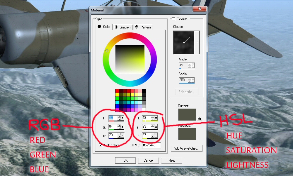
Hover over the picture to the left and have a look at a typical color control panel found in every graphics software. You can create a specific color using either format - RGB or HSL. Personally, I would say that HUE is the most important value. If you are chasing a color and trying to find that perfect match, it is the HUE that will be the basis for your project. You can use photos from online to find the correct HUE, and then stick with that HUE number and play around with the SATURATION and LIGHTNESS. The RGB format is not a good way of chasing after a specific color value.
A simple way of understanding color is to look at "GRAYSCALE". Grayscale is a scale of black and white with no hue or saturation whatsoever. Grayscale only involves lightness - on a scale from pure black (0,0,0) to white (255,255,255). The moment you introduce HUE and SATURATION into the equation you are dealing with real "color". And with NO SATURATION, the HUE value means absolutely nothing. HUE and SATURATION are teamed together and work together. All of those numbers in the boxes in the screen-capture have a range of 0-255. Hue is the color, Saturation is how much of that color, and Lightness is what it is.
By DECREASING SATURATION, you are basically replacing color with the colorless white/gray/black spectrum. Faded paint, or reference photos taken in poor light, will have less saturation. Keep this in mind when doing online research.
For aircraft repaints there is no pure white, pure black, or pure color of any kind. Stay away from those RGB values of 0,0,0 and 255,255,255. Stay away from high SATURATION values of any color. Saturation settings go up to 255 as well, and if you find yourself using a Saturation above 200 you need to pause and question what you are about to do. This is the danger zone for realism and accuracy. Real life rarely includes such high saturation levels. Sometimes it does, but not often. Look at some photos of real life and check out the colors in them before proceeding to try and duplicate real-life aircraft paint schemes. I have seen some wonderful work done by other repainters, but sometimes those stark high-saturation colors are calling me to grab my sunglasses. It's just too much, and it's not realistic.
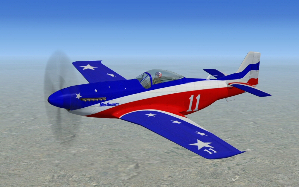
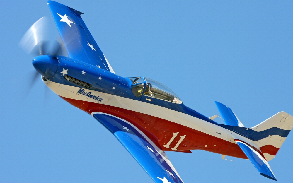
This is the difference between fake and real. A glance at these screen captures and real photos are self-explanatory. The blue is obviously the biggest problem. This is what I mean by chasing after a color in a photo to duplicate it in a repaint. It is the HUE that is incorrect on the Microsoft model. In your graphics software you can click on the photo with an eyedropper tool and see what hue that blue shows up as in different areas of sunlight and shadow. Once a hue value is decided upon the rest is easy. I'll get into this later in Chapter 2.
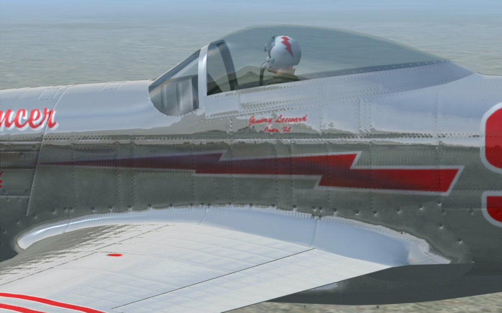
This shot shows the limitations of low-resolution bumpmap files. When FSX came out this was state-of-the-art, but it's not up to the standards of modern computers. Everything looks exaggerated and reminds me of a die-cast model with gigantic seams and details. The goal is to make our experience in FSX as realistic as possible. You can open a 1024x1024 pixel file and simply double its size to 2048x2048 and save it. Then, of course, you can make every line and detail twice the resolution of the original textures. FSX DOESN'T CARE WHAT SIZE THE FILE IS - IT WILL EAT WHATEVER YOU FEED IT.
Another issue with this P-51 is that the bumpmap file was saved in DXT5 format. DXT5 compresses a file and turns pixels into large blocks while other formats maintain original pixels. High-resolution is better for graphics, but it weighs heavy on a computer's graphics card. When you spend so many hours on a repaint, do it in high resolution, large files or quality. Think big! Then you can downsize or degrade it however you want later. Graphics quality is a one-way street. Quality can always be reduced, but can never be increased without recreating a file. Don't limit yourself.
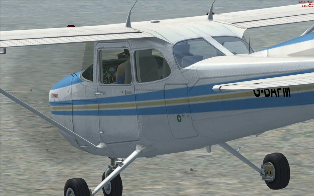
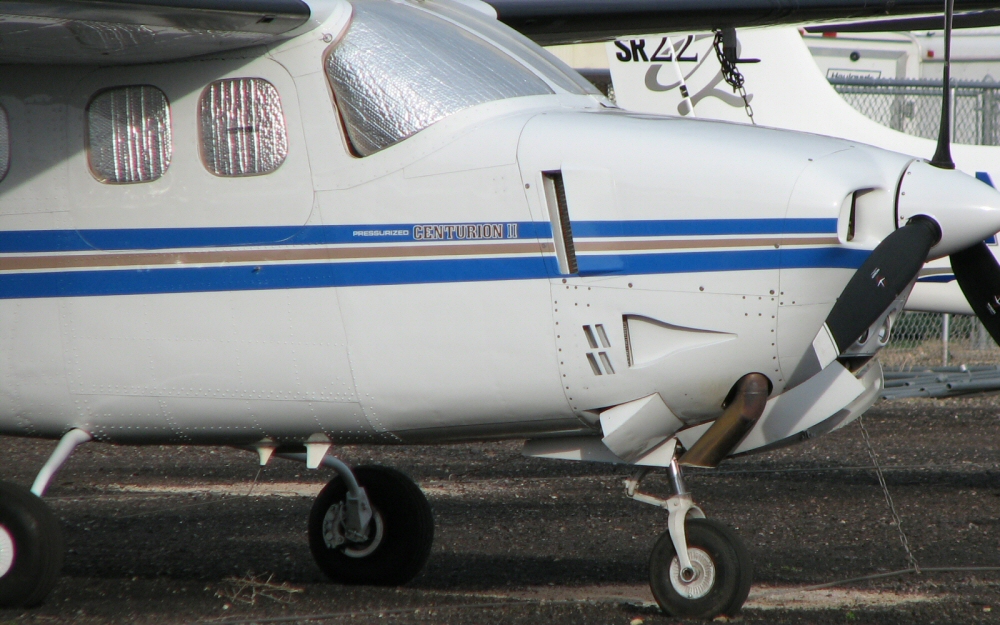
This 172 is a great example of the outdated standards of the original FSX models - impressive for FSX when it came out, but that was over a decade ago. Look at the rivets on the 2005 FSX Cessna and compare them with the rivets on the lower portion of the real deal. Again, this is about resolution and file size. If I were going to put the time and energy into creating a repaint kit for this Cessna I would first double the size of the texture files. The effort required to create a good repaint kit demands that I don't limit myself from the outset. I would double the file size without question. Just remember that a 2048x2048 pixel file is actually 4 times the area of a 1024 file. Doubling resolution will affect computer performance exponentially. But you can always downsize the final product if you want to.
Remember that aircraft are imperfect, dirty, and play in harsh environments. Even if a plane is pampered within an expensive hanger, it lives its real life out in the wild blue yonder and gets pelted with rain and sun. They leak fluids and exhaust, and may look perfect from a distance, but up close they are clanky leaky dirty machines made of metal. Creating repaints for FSX aircraft is much about coming up with "perfect imperfections".
Just as colors are not perfect, neither are panel lines, rivets or stenciling. You will want the details in your repaints to be as imperfect as you see in photos of real aircraft. Spend some time on the details. Put in the extra effort that others have not. It will set you apart from them. With just a little attention to detail you can create repaints that catch people's attention, rather than just "run-of-the-mill" and don't get flown as often. I'll get into panel lines a bit later.
STUDY REAL LIFE. Take photos of aircraft, or download them from the Internet, and check out the details. Look at the RGB/HSL values, panel lines, rivets, and differences between shiny and dull materials; all in different angles of sun and shade. The RGB/HSL values in photos might surprise you. There is a lot to be learned from photos of real aircraft sitting in the sun or under clouds. Afterall, this is what you are trying to recreate within the world of FSX.
Reality and nature are your competition. Do NOT try to mimick someone else's repaint style, profile art, or even modern restored warbirds. They don't always mimmick original WW2 examples. Maybe they aren't trying to! There are amazing artists in the world who's work astounds me, but I have to remind myself that I am not competing with other artists - I am competing with the real world and HAVE MY OWN AGENDA. So, don't get distracted. Focus on duplicating what is seen in the real world and not following other artists no matter how good they are. Their agenda and goal may have been different than what you are seeking to create. I discovered a LOT of modern restored warbirds that are quite different from the original wartime combatants.
An extreme example of this is the real-world P-51 "American Beauty" found HERE. This is a beautiful Mustang indeed! However, this is a somewhat famous Mustang that I recreated for A2A's Wings Of Power 2 P-51, that was probably my most downloaded repaint for that A2A model. So popular is this paint scheme that A2A included it with their badass WoP3 Mustang.
The problem with "American Beauty" is that someone saw photos of the original (so the story goes) in poor light, and the Olive Drab appeared to be blue, instead of the OD that was thrown onto the upper surfaces of many aircraft that were based in France and the Low Lands after D-Day because the fear of Luftwaffe attacks on airfields. So blue was not the real color! Yet someone spent thousands of dollars on a plane that cost millions of dollars to have it painted with Blue instead of Olive Drab. Again, maybe it wasn't a mistake, but was their preference. I tend to think this is the case. But for someone looking to duplicate the original WW2 E2-S Mustang, the modern American Beauty would be misleading.
Likewise, my own repaint of E2-S utilized some poetic license and I made changes from the original. E2-S is my own personal favorite paint scheme, and I created a repaint depicting what my own P-51 would look like if I were a millionaire. I built a plastic model of that plane when I was a kid and I have loved that scheme ever since. The lines of the Olive Drab did not duplicate the original WW2 version exactly. My aim was to create a modern clean-looking paint scheme that didn't follow the messy rushed paint job that was performed during the war. My Olive Drab was different with the anti-glare panel around the exhaust stacks and below the windshield. I did that on purpose. The carburetor intake panels were also changed on my repaint (those panels with rows of holes on the lower nose). My repaint of a modern Mustang wouldn't be opperating in a frigid European winter, and would be okay with the panels full of holes.So don't follow MY work either! I had my own agenda when doing that repaint, and it was not meant to be exactly like the original. A2A recreated the original wartime paint scheme with their WoP3 Mustang perfectly! They didn't copy my version and obviously used photos of the original aircraft. Case in point...
The original E2-S HERE.
My historically innacurrate version HERE.
So, my point is that if someone were setting out to recreate this aircraft repaint for FSX, they might stumble across someone else's mistake, or their preference, then duplicate it themself. ALWAYS SEEK OUT ORIGINAL ARTWORK FROM WW2 PHOTOS if that is what you want. Don't base your work on another artist's work. Even well-paid professionals who work on restored warbirds and Hollywood movies make some big mistakes. Just because they are professionals doesn't mean they should be used as referrences. I don't want to sound too critical of the paint scheme on American Beauty. It was painted way before the advent of the Internet! They didn't have the resouces that we have today, being able to hop online and find a miriad of reference photos with the click of a mouse.
One area of concern is aircraft insignias. I rarely see insignias that are correct, even in Hollywood movies! In the mini-series "Band Of Brothers"there is an obvious mistake in the 3rd episode at the beginning where they show a glider wing with insignia in the foreground. The dimensions of the chevrons and outer border are wrong, and the tips of the star do not reach out to the chevrons. This is small stuff that no one notices in a movie, but it's an example of how even the professionals get things wrong. Just be careful where you get your information from.
Here are some reference links for insignias:
>US insignias halfway down this page..
>More insignia evolution here..
>USA Air Force Roundels 1915-Today..
>German military aircraft insignia..
>Japanese military aircraft insignia..
Are these different references correct? Do they agree with each other? You tell me!
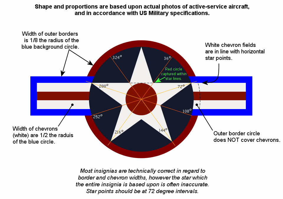
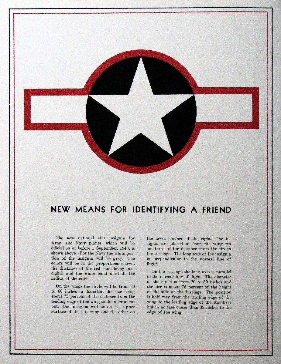
At left is my own tech sheet for the US insignia. It is based on this official US Army Air Force specification issued during the war. THIS is the type of original and true references that I'm talking about. This is the real deal!
Please, for the love of God, don't use plastic model decals (or online scans of such) as your reference material! They are notoriously incorrect and too small to be dependable. This is the Internet "information age". Take advantage of that.
An interesting fact is that lots of us folks who are interested in aircraft are also interested in cars. Planes and automobiles have one thing in common when it comes to paint - they both live most of their lives out in the harsh environment. They both are painted on the outside, and get pelted by Mother Nature. So keep in mind that there is much to be learned about "weathering" on cars as there is with aircraft. If you are doing online research about color and weathering, it might be a good idea to look at car photos as well.
LESSON #1: Layers.
Why am I beginning with something as complicated as Layers when this is supposed to be a basic 101 class on graphics?
There is a reason I made "Layers" Lesson #1 in my tutorial. When I started into computer graphics back in the early '90s I avoided layering. I was scared of such a complicated subject. It was one of the biggest procrastinations in my graphics life.
You need to learn about layers right NOW, or just stop reading this and walk away from repainting.
Hopefully, you are reading this and taking it with a grain of salt and shrugging it off, as layers have never been an issue for you. But, for myself, it was a big hurdle for me. I put off learning about layers for quite some time. I don't want you to waste the time and effort on graphics that I did because I did not understand Layers. After I got into layers I kicked myself for putting it off. I could have saved myself so much time and trouble had I gotten into it sooner. LAYERS ARE EASY. Unless you get your arms around layering, you will not be able to progress to any competent level of graphics artistry. Layers make life easy and simple - not difficult.
Truly I say unto thee, Layers are your friend!
Think of a computer graphics file as a notepad with umptine number of translucent see-through plastic pages layed on top of each other. This is what layers are like. A layer in a graphics file is translucent, and only what you put on that layer is what shows up on that layer. You could put a single pixel dot on a layer and that is all that will show up on that layer. The entire layer is not a sheet of white or something, but transluscent like glass. (This is something I didn't understand as a beginner) You can draw something on each sheet, then lay them on top of each other to create a final drawing.
In the wonderful world of computer software you can simply turn Layers ON and OFF with the click of a mouse. This is an important point for experimentation. Say you create some graphics on one layer that you kind of like, but aren't totally happy with. Just DUPLICATE that layer then go to town on it. Fly, be free! Do whatever you want on that layer. This is one major way that layering can help you. Layers enable you to tinker around in a file like never before. You can DUPLICATE a pre-existing layer of work, then play with the duplicate layer to your heart's content. If your imagination and experimentation leads you astray, no harm done. That duplicate layer can be deleted if it gets you nowhere. If, on the other hand, you progress toward your objective, then you can keep the new duplicate layer and delete, or turn off, the old one.
If you like both layers, keep them both. I often have duplicate layers of the same work in my files. For example, while working on the propeller hub of the Aircraft Factory F4U Corsair I created graphics for bare aluminum that looked pretty good by my standards. However, there are many Corsairs that have black prop hubs or painted the same as the fuselage, like USN Sea Blue. So I just duplicated my original prop hub layer and filled it in with a solid color. After that I set the OPACITY of the new solid layer to 90% or thereabouts, so that the underlying bare aluminum graphics showed through just enough to give the new layer on top some texture.
In many ways, using layers allows you to create aircraft skins and paint them just like in real life. Take my Corsair prop hub for example. I had graphics for a bare aluminum hub alreay created, then I duplicated that layer so that I could paint on top of it. This is just like painting an actual piece of aluminum hardware in real life. The difference is, in real life if you spray too much paint onto something you're kinda stuck with it as is. On a computer you can play around with the OPACITY of layers forever and ever and get exactly what you want. Save the file and you can always go back and change the OPACITY of a layer at any time. Layers allow you to doodle and experiment to no end, without affecting previously created artwork. How cool is that?
Another cool thing is that you can leave notes for yourself right in the file. This is something I do in every aircraft texture file. I create a layer and label it TEMP or NOTES, and I keep this layer at the top of the stack. This is where I use the font tool and write notes to myself about insignia size and pixel coordinates, font type and size for stenciling and cockpit labels, tell myself which area in a file paints which part on the 3D model, etc. I lay down the notes and then keep that layer turned off most of the time. It's for my eyes only.
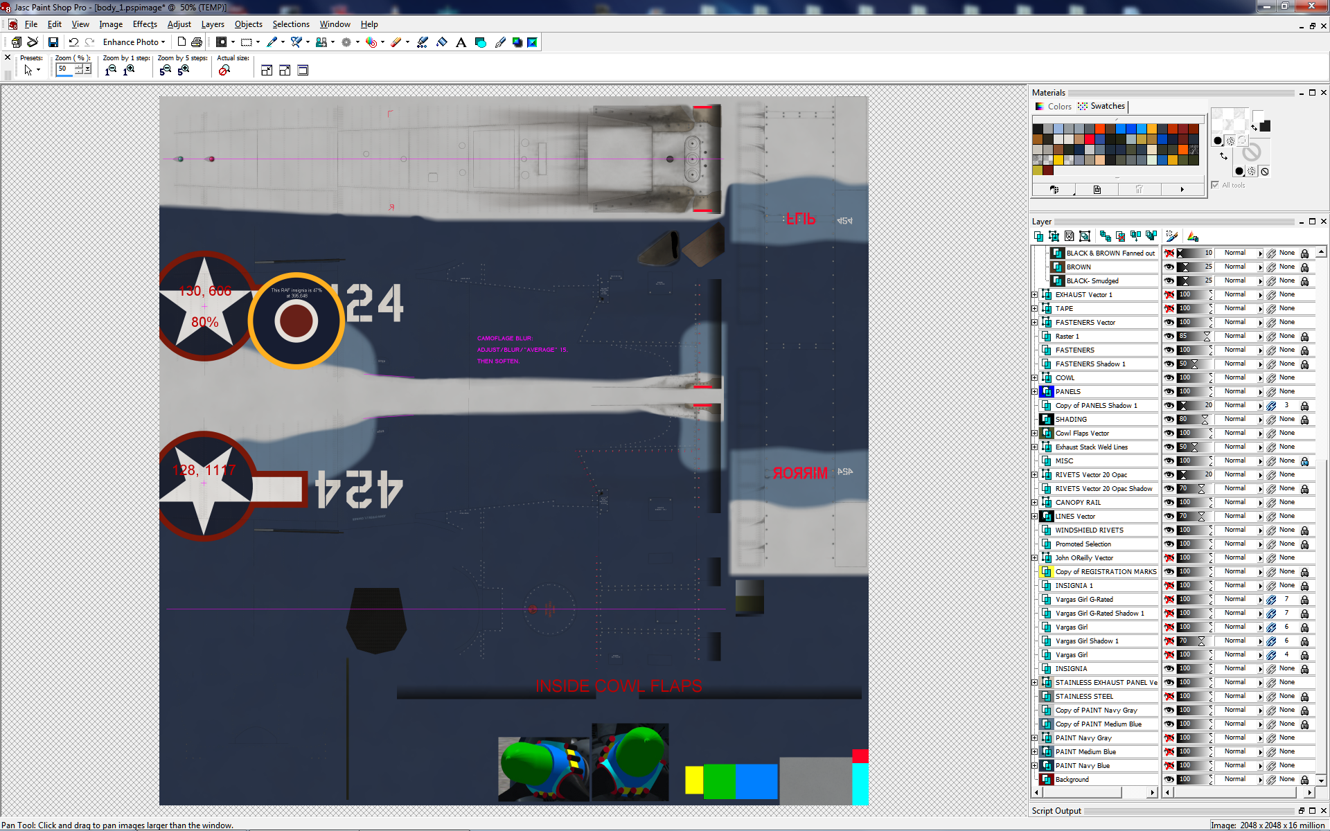
At left you can click on the image to see my notes layer in a file for the Aircraft Factory Corsair. This is the file for my personal Corsair ride that won't be uploaded to the public. It is also my master file. When I create a new repaint I copy the four master files to a new folder and then start working on them. This way my notes layer travels to each new repaint project. You'll see my pixel coordinates for insignias, notes on the cowling for how graphics need to be oriented, what-paints-what on the prop hub, and magenta-colored notes for creating camouflage (I'll get into that later).
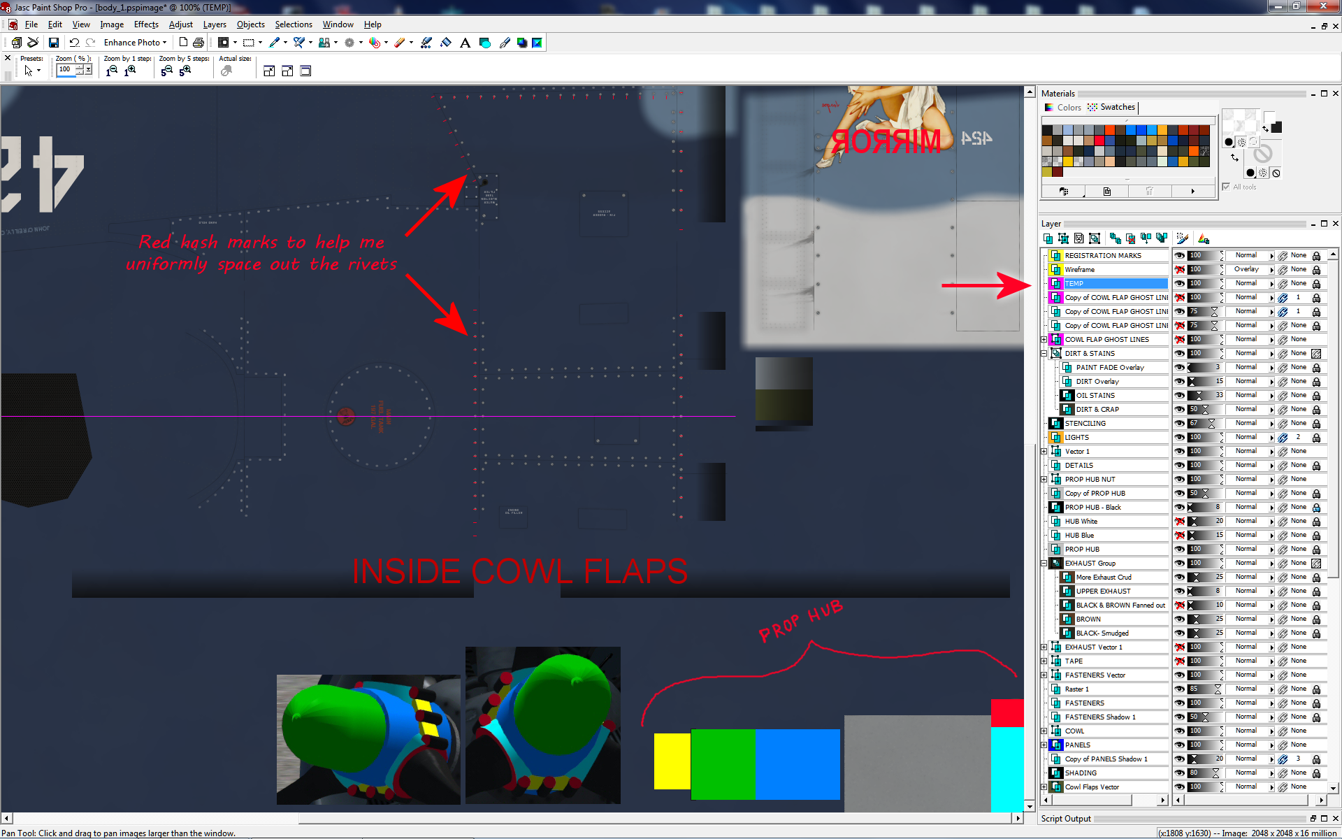
At right is a closer view of my notes for how to paint the prop hub. I painted the model with the TEMP layer turned on, took a screen-shot, and then pasted part of the screen-shot right into my TEMP layer as a quick reminder about the details of this. Corsairs have different paint schemes for the prop hub and this is a simple way to remind myself what is going on without having to hunt down the screen-shots while I'm in the middle of painting.
At left is another notes layer showing the Corsair wing file and how I found what painted what inside the leading edge intake. Again, I cut & pasted from a screen-capture and put that right into my notes layer as a visual reminder (inside the dotted circles).
See how helpful a notes layer can be? You can put anything you want on a notes layer for your eyes only. No one will ever see that layer on the final product.
Speaking of finding out which area of a file paints which part on a 3D model - I have a quick method of doing that when there is no wireframe available in a paint kit. It's the quad slice-and-dice method. I'm not the only one who has come up with this. I've come across others in forums who use the same method.
So, you are scratching your head trying to figure out what in the world paints a particular part of a 3D model. Frustrating! Just create a new temporary layer and chop it up into quarters. It doesn't have to be precise or even use the colors that I use here. Just quarter that bastard and throw down some colors of your choosing. It's all about creating contrasting obvious colors that will stick out on the 3D model when you boot it up in FSX. I create the DDS file using that quartered file, then open up FSX and see what's what.
Okay, so that mysterious part is now colored Yellow. I'm getting closer. Now I take that Yellow quarter and do the same thing - I slice-and-dice that Yellow quarter into the same colors all over again on a smaller scale. You see where I'm going with this. It may sound tedious, but actually goes quite fast and saves time in the long run. I can usually find the part in two or three tries.
Here be an example of me using this on the cockpit of the Flight Replicas® Me-262 cockpit. I was pulling my hair out trying to find out what painted a rail inside the cockpit. Turned out, it was painted with another file that painted exterior parts, but after a few tries I was able to cross certain VC files off the list and track it down. I finally nailed it and kicked its ass.
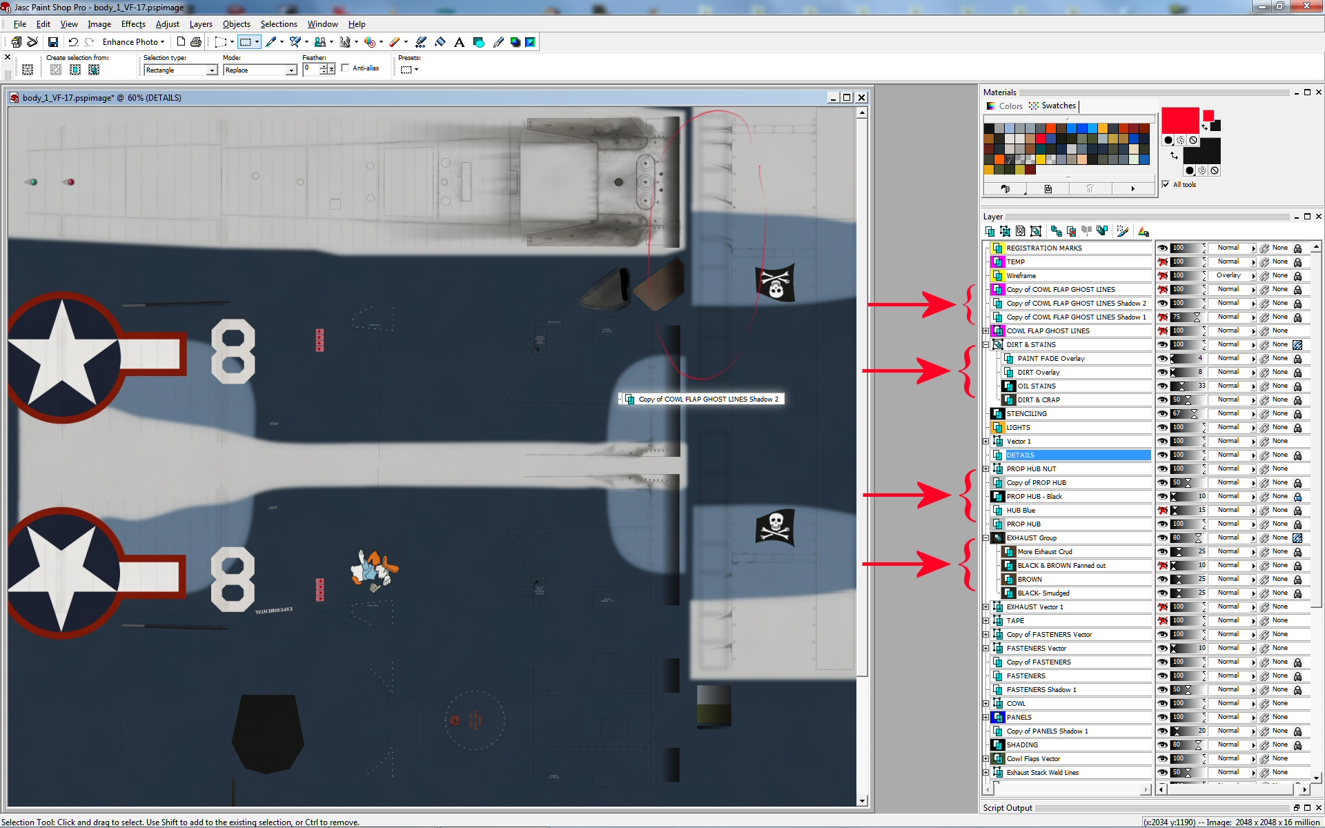
Just out of curiosity you might want to have another look at my Corsair "body_1" file just to rummage through the different layers, how I have them grouped, and what opacity each one is set to. Remember, the order top-to-bottom DOES matter, just like a real paper pad or even the scenery files in the FSX scenery library - the one above covers the one below, but THE OPACITY OF THE ONE ABOVE WILL ALLOW THE ONE BELOW TO SHOW THROUGH. This is important to remember.
You might find it surprising that I have the Stenciling layer set to 67% opacity. This helps make the stenciling less stark and more realistic. I think I have since changed this to 80%. That's one nice thing about layers - you can save them in a file, but their settings are not permanent.
I talked about the prop hub earlier, and you can see those layers turned On or Off to get the desired outcome (3rd arrow). Notice how I worked the exhaust layer group, using multiple layers at different opacities to create the dirty engine exhaust (2nd arrow). I can play around with the opacities of the layers to create different exhaust crud for different repaints, making a particular aircraft cleaner or dirtier. I'll get into this later with examples of the exhaust stack shroud of the "Wings of Power 2" Mustang.
HEADS UP! Toward the top of the stack you can see a layer named "COWL FLAP GHOST LINES". This is a temporary layer of lines created for the sole purpose of creating a "drop-shadow" on the cowl flaps. Since the cowl flaps are separated in the 3D model I didn't want to create panel lines for them as that would be redundant, but I did want to create some dirty effects along their edges. You can see this to the left of the Jolly Roger flag where there are shadows but no lines. I often will create ghost layers for the purpose of creating drop-shadows, then turn those ghost layers off.
You can see that I have two copies of "COWL FLAP GHOST LINES Shadow". I scratched my head when I saw that and couldn't remember why I'd done such a thing. Turns out, I created the first drop shadow with a lower level of blur for the shadow. So I created a 2nd drop shadow with a higher level of blur, and probably duplicated that 2nd copy and merged the two new copies together to create a darker drop shadow. I hope you followed all that. I created duplicate layers and played with them to my liking, which is a main purpose of layers.
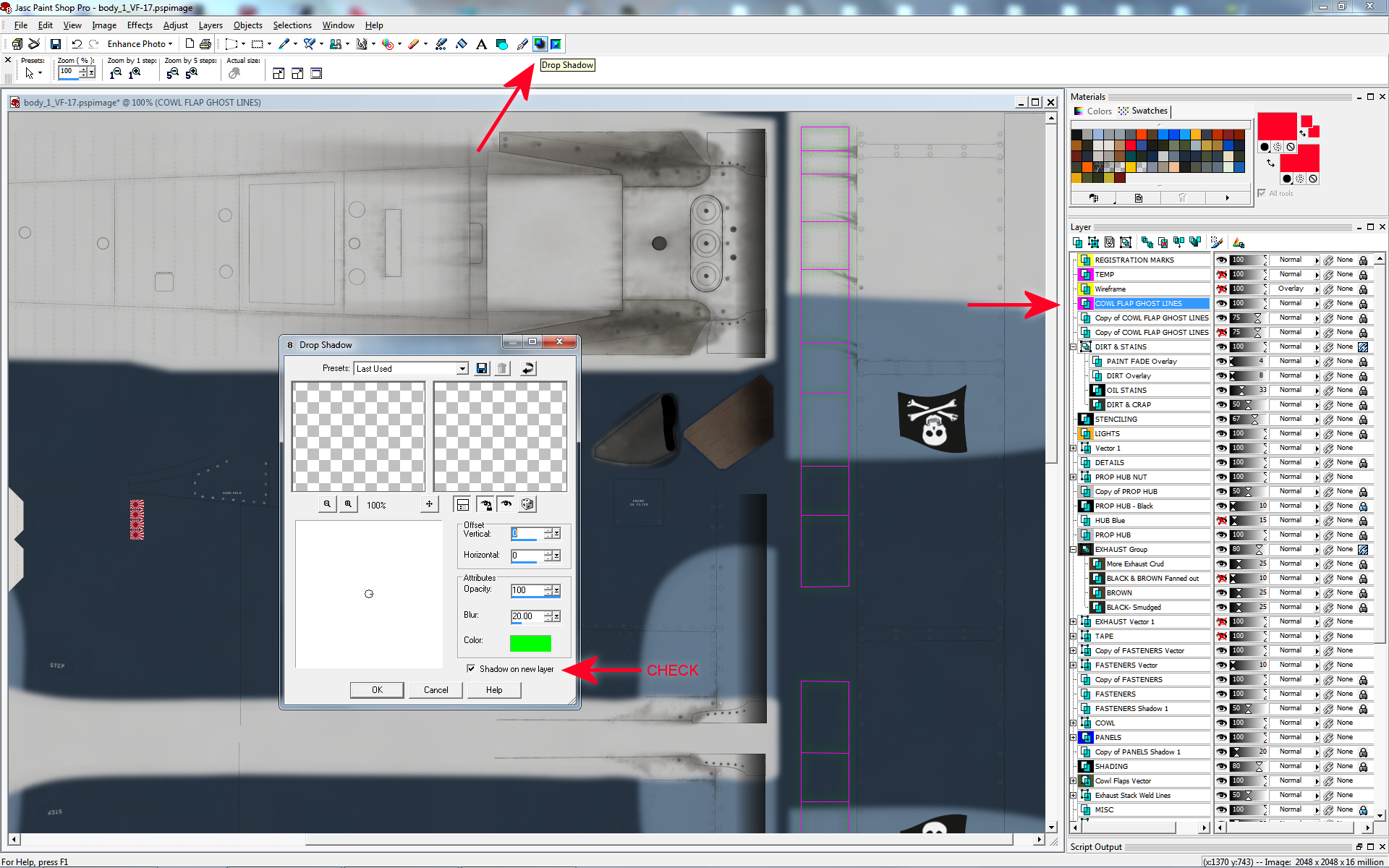
So I highlight the layer that I want to drop a shadow from - in this case, "COWL FLAP GHOST LINES". Then I click the Drop Shadow tool at the top, which brings up the pop-up menu. For this example I am picking the obnoxiously bright green to help show the Drop Shadow. The GHOST LINES are the bright Magenta lines, and you'll be able to see the faint green of the Drop Shadow around them. If I want more prominent shadows then I can just duplicate the shadow layer. Clicking the check-box in the menu automatically creates the shadow on its own new layer. Click, click, click and it's done.
LESSON #2: Color.
I'll be honest right off the bat. Coloring your repaint is one of the most difficult tasks in repainting. Picking colors and "chasing colors", as I put it, can be frustrating. I want to talk about real aircraft for a bit here, and focus on military aircraft during World War 2. Not that I was there, but as I understand it, the deal is that there are two different colors of paint used on real aircraft - factory specifications and what really ends up on an airplane. Those are actually not two different things, but a hundred different things.
A factory puts out a recipe and military specification for a color, and then the factory paints the aircraft with that recipe. But that recipe changes a little from batch to batch (just like modern cars, and how a body shop can have trouble matching the particular factory color on your damaged vehicle). Then, in the field, the ground crews use batches of paint shipped from the factory that have spent a month or more in a ship or warehouse and they aren't mixed properly. Time is money and lives during a war. I imagine that ground crews didn't give a rat's ass about the details when painting aircraft. They had more important things to worry about.
So they mix up the paint and spray and brush it on and the job is done. Then this plane sits out in the sun and rain and gets pelted by Mother Nature. And in between missions the plane may be polished with wax to give their pilots an edge. See where I'm going with this? There is no norm, and there is no perfect color for any paint recipe. This may sound frustrating, but it gives you the luxury of some "poetic license", because there is realistic room for error and you have reason not to worry too much about this. Just do the research, get the factory recipes for paint, study photos, and come up with the best that you can through trial and error. No one else out there has perfect color in their repaints. I don't. But don't worry about it, because there was never a perfect color in the first place! Don't chase ghosts, but get it looking good.
I've said it before and I'll say it again. Repainting aircraft for FSX is often about coming up with the perfect imperfections! Remember this.
I have spent a lot of time online looking for particular "RGB" or military ANA recipes for factory specifications. That's a good thing to do. I'm not bashing that direction of action. But I want to say here that, in the end, the photos you find online will give you a better idea and feel for what the colors in your repaint should be. I have gone through the process myself of finding the ANA mil-spec (military specification) recipe data for colors, but in the end I went with something quite different all because of the reasons I explained previously about aircraft in the real world being pelted by Mother Nature.
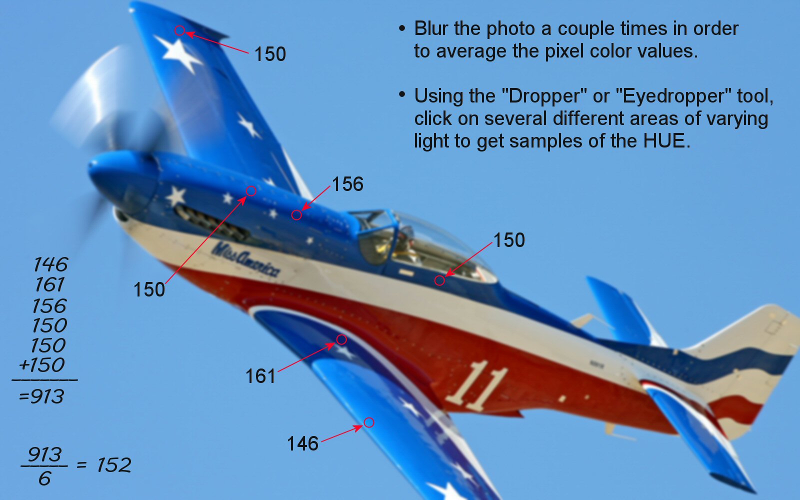
I touched on the subject of "chasing colors" before, so let's go hunt down a color from a photo. Click on the photo at left and you will see how I approach any given photo. The first important step is to blur the photo a lot. Blur it a couple times if needed. What this does is blend colors together so that you are not basing your information on a single rogue pixel but, instead, that area of the photo you are interested in. Don't forget what you're doing and save the photo and ruin it! You just want to use it and abuse it temporarily and close it without saving once you're done grabbing data. Most programs have an "Eyedropper, or Dropper" tool that can be set to grab color from different sample size blocks to perform the same action as blurring the photo. Either way works.
As you can see, I pick different areas of the aircraft in stark sunlight, shadows, and a couple spots in between. I write down the HUE values and then average them out. I actually don't spend as much time and energy on this as depicted in my sample photo, but this will show you the degree you can take it to and what it's all about. Now, in this photo you can see I find HUE values in the 150 range. Mathematically, the average is 152, but notice that 150 pops up three times and that the extreme values are in the sun blasted spots and the dark shadows. So I would probably just go with 150 or 152. Keep It Simple, Stupid. This isn't rocket science, unless you are repainting a rocket of course. After some experience with this you will know what you need to do and not waste much time on it.
So what about the other values for the color, like SATURATION and LIGHTNESS? When I arrive at a HUE that satisfies me, I use those same areas to pin down proper SAT and LIGHT values. Use the "Eyedropper, or Dropper" tool to grab colors from the photo again. Pick areas of average light to get average LIGHTNESS and SATURATION values. Remember that levels of light in any photo will affect saturation, so where you find good values for one you will find good values for the other. But it is values of HUE that come first! By using my method of chasing down good values for HUE, you will also find quality spots of color in a photo, and you can use these "friendly" spots to get your good data from.
In the end there will be a bit of "trial and error" to get the correct colors on your simulator aircraft. This is what makes "color" one of the most difficult tasks in repainting. You will want to find good colors with enough SATURATION and LIGHTNESS (or darkness), and then you can tweek these later with "weathering layers" in your paint kit.
Most paint kits use these weathering layers and I'm no different. They are a "faded" layer and a "dirt layer". One is for affects of the sun fading the paint, and the other is for dirt and crud. If these are LAYERS within your paint kit, you can always play around with the OPACITY of those layers to get desired effects.
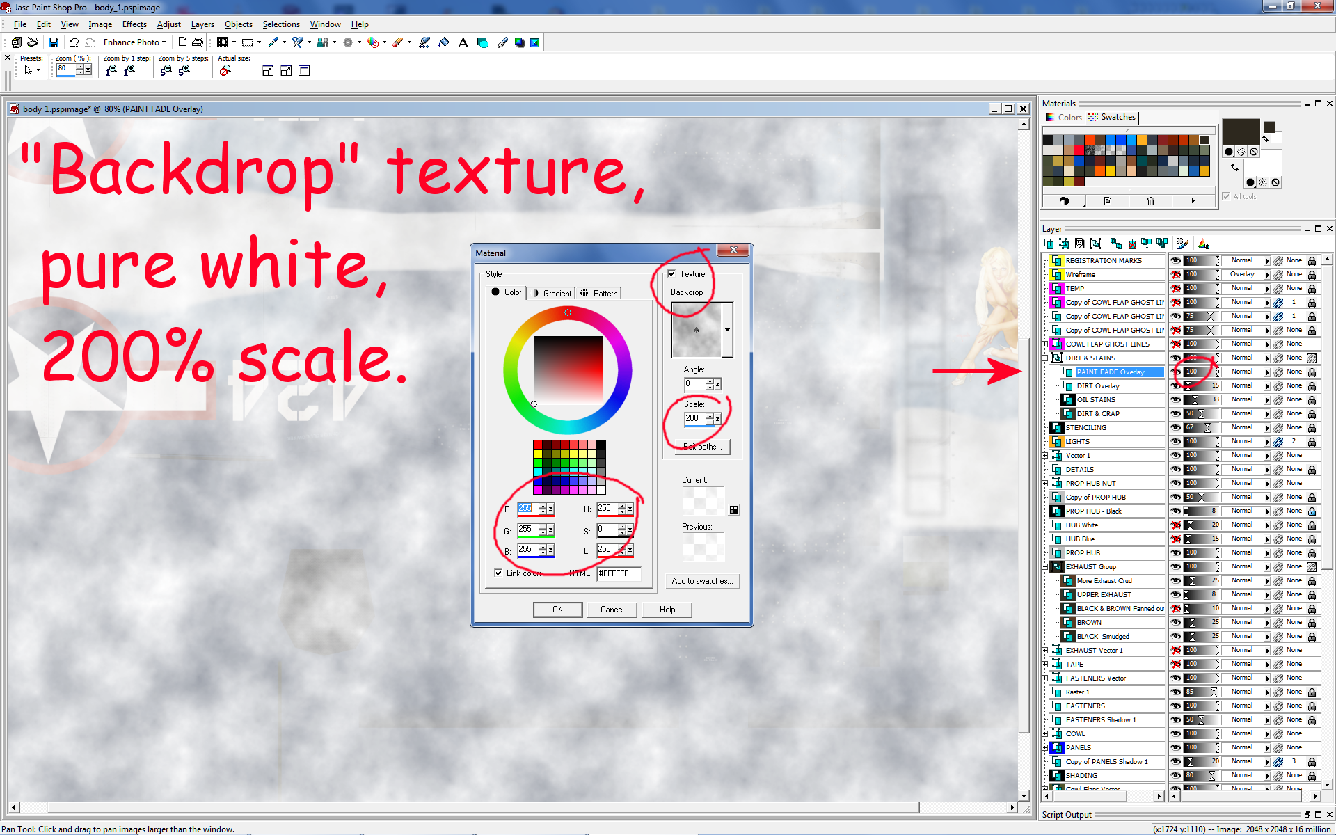
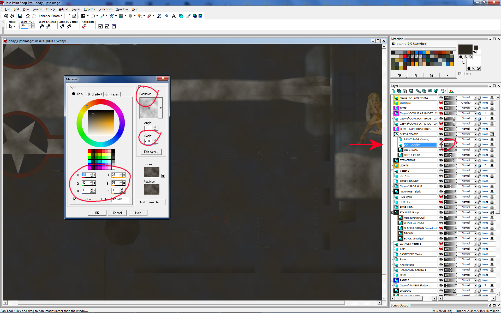
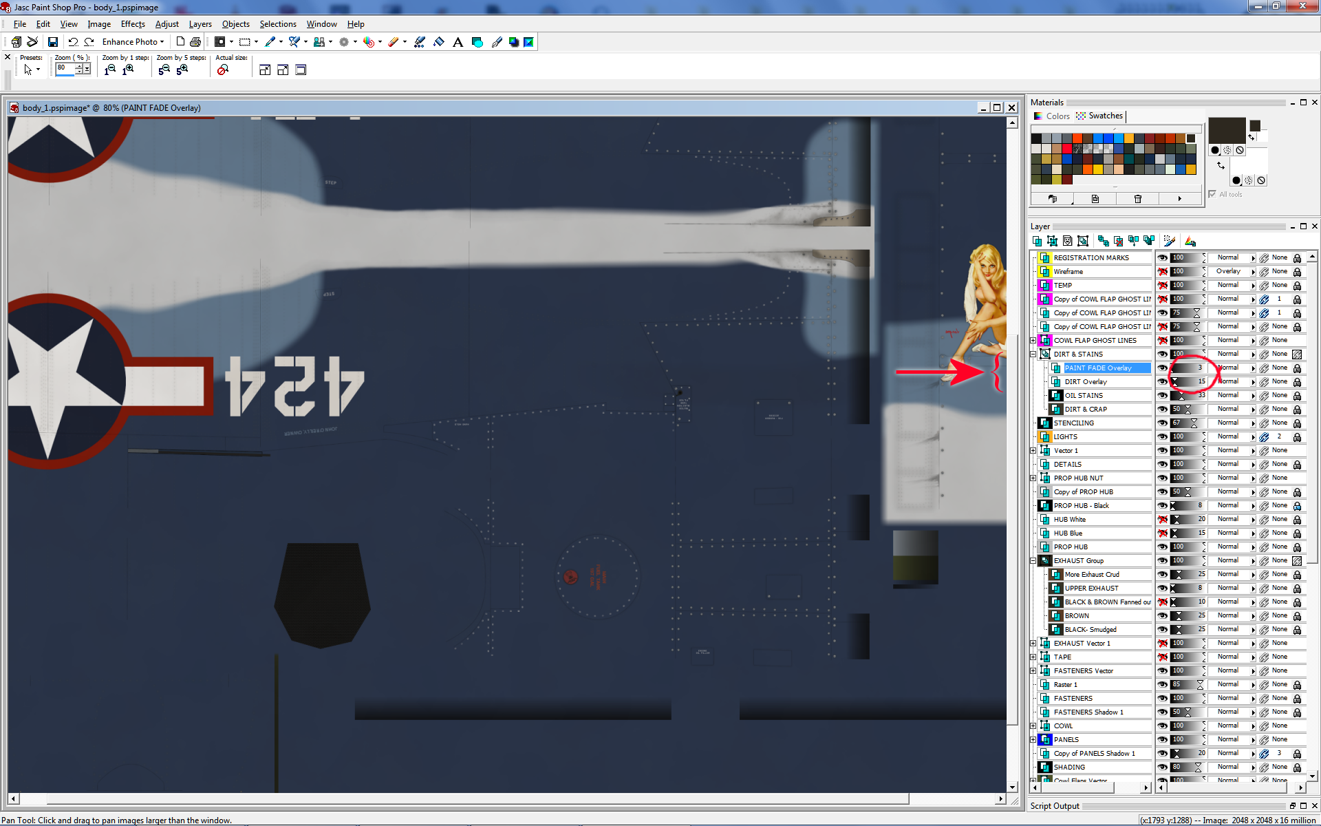
Clickie clickie on the screen captures to take a look at a couple of mine. I'm showing them at 100% Opacity, but in my paint kits I usually have their opacity in the single digits. It doesn't take much!
This third image shows the final product. You can see that I actually have the opacities turned way down to 3 on the paint fade, and 15 on the dirt layer. And in the second screenie you can see my super-top-secret color swatch for dirt! How special. Don't ever say I never gave you nothin'. And stop staring at the Vargas girl. This is my personal Corsair ride that won't be uploaded. Sorry... Hey, I just gave you dirt! What else do you want?
In the end, you will come up with what looks good to YOU. In my work I have come up with what looks good to ME, and hopefully others like it too. You may look at my work and find that some things don't agree with your eye. And that's fine. None of us will agree on specific color codes and numbers. As I explained before, this work we do on FSX repaints mimicks the same type of disparity that is found on real aircraft.
Hell, we might not even agree on the best Vargas girls! Ya just never know... Life is fricken fickel.
Here are some helpful websites for proper color codes. What you want to find are codes for FS-595. That FS isn't Flight Simulator - that stands for "Federal Standard 595", which is a color standard created back during World War 2. Also there were paints used in the UK developed by Dupont to try and mimick the colors on aircraft and vehicles coming over from the US. You will find that different websites don't agree with each other in regard to specific numbers and recipes. See, people have been trying to match colors for several decades now. We're certainly no different!
The best website for color codes and cross-reference. Clicking on a swatch will give you RGB, Hex, and FS-595 codes:
http://www.e-paint.co.uk/Federal_standard_595_colour_chart.asp.
Helpful site with FS-595 and Hex cross-references.
http://www.fed-std-595.com/FS-595-Paint-Spec.html.
Another helpful site with FS and Hex cross-references. This site is geared toward webmasters and HTML, but gives good information about FS-595:
https://www.w3schools.com/colors/colors_fs595.asp.
CMYK to RGB to HEX converter:
http://www.ginifab.com/feeds/pms/cmyk_to_rgb.php.
LESSON #3: Panel Lines.
I'll start with the worst-case-scenario. Total Charlie-Foxtrot. You have no paint kit to work with, but you can open up DDS files with your secondary software. First step is to DUPLICATE the original layer and create a new LAYER identical to the original paint file. This will enable you to keep the original graphics in the background whenever you need it, and create a new layer that you can play around with and screw up to your liking.
I usually start out by creating VECTOR lines over the existing panel lines on the original artwork. By "panel lines" I mean the lines that separate the sheet panels that build the outer skin of a real airplane. Click your VECTOR tool and just start making lines. They don't have to be perfect right off the bat. Just start making lines. You can edit their point positions, texture, opacity and color later. Again, I usually start out by using some stark bright color like red so that I can better see what I'm doing in contrast to the underlying "original" layer. Then, once I have things in place, I can play around with color, texture and opacity for the final product.
In addition to Panel Lines, I create a separate layer for "Access Covers". Aircraft skins are littered with little access hatches in order for maintenance crews to get in through the skin of an aircraft and adjust or service anything from fluid levels to cables. I put this Access Covers Layer on top of my Lines Layer, because in real life access covers sit on the outside of an airplane's skin and will cover any panel lines that build the skin. You will likely have lines on these two layers intersecting each other, and you want the access covers to be on top.
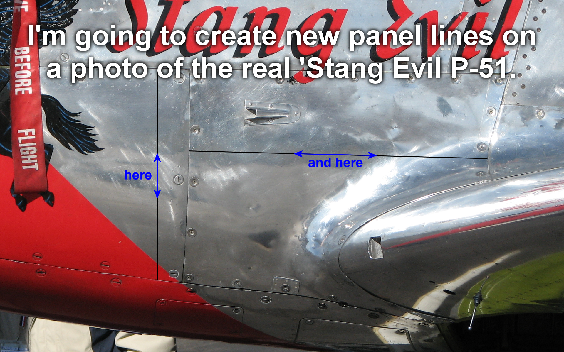
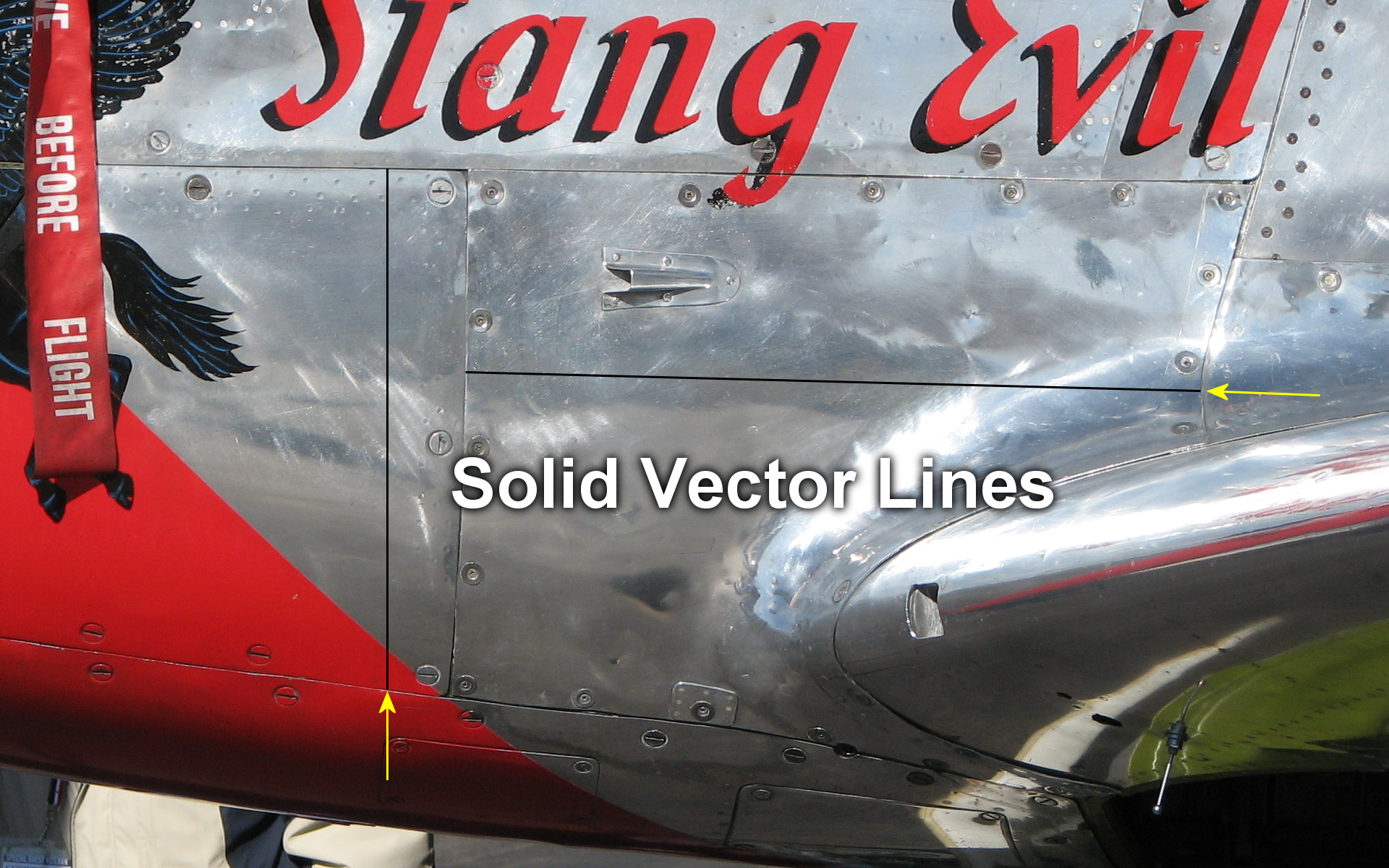 All you need for a panel line is a solid black line, right? How does the solid black line compare with the existing panel lines?
Something isn't right. The real lines in the photo have a black gap and a white edge that reflects light. These black and white lines kind of dance around each other with varying widths and opacity. This is simply because the panels on an aircraft aren't perfectly aligned or flat. How can we change those lines to mimick the real photo without too much difficulty?
All you need for a panel line is a solid black line, right? How does the solid black line compare with the existing panel lines?
Something isn't right. The real lines in the photo have a black gap and a white edge that reflects light. These black and white lines kind of dance around each other with varying widths and opacity. This is simply because the panels on an aircraft aren't perfectly aligned or flat. How can we change those lines to mimick the real photo without too much difficulty?
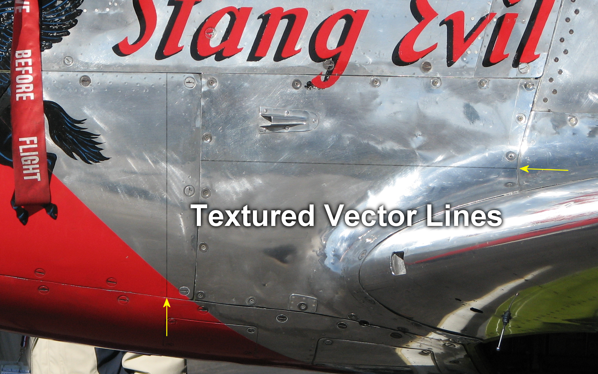
Let's break up the solid attribute of those lines. Using the vector line tool I'll click the texture button so that the line is now created with textured color that fades in and out.
I'm getting there. That's a drastic improvement over the solid line. Still, it's a bit light and there is no reflection along the edges of the panels.
I'll play around with different textures and scales of that texture till I come up with something I like. If a particular texture works well at a certain scale then I'll write it down in my notes. I have a note sheet for each aircraft I do, so each time I stop working on an aircraft for weeks or months, I don't come back completely lost about my own techniques.
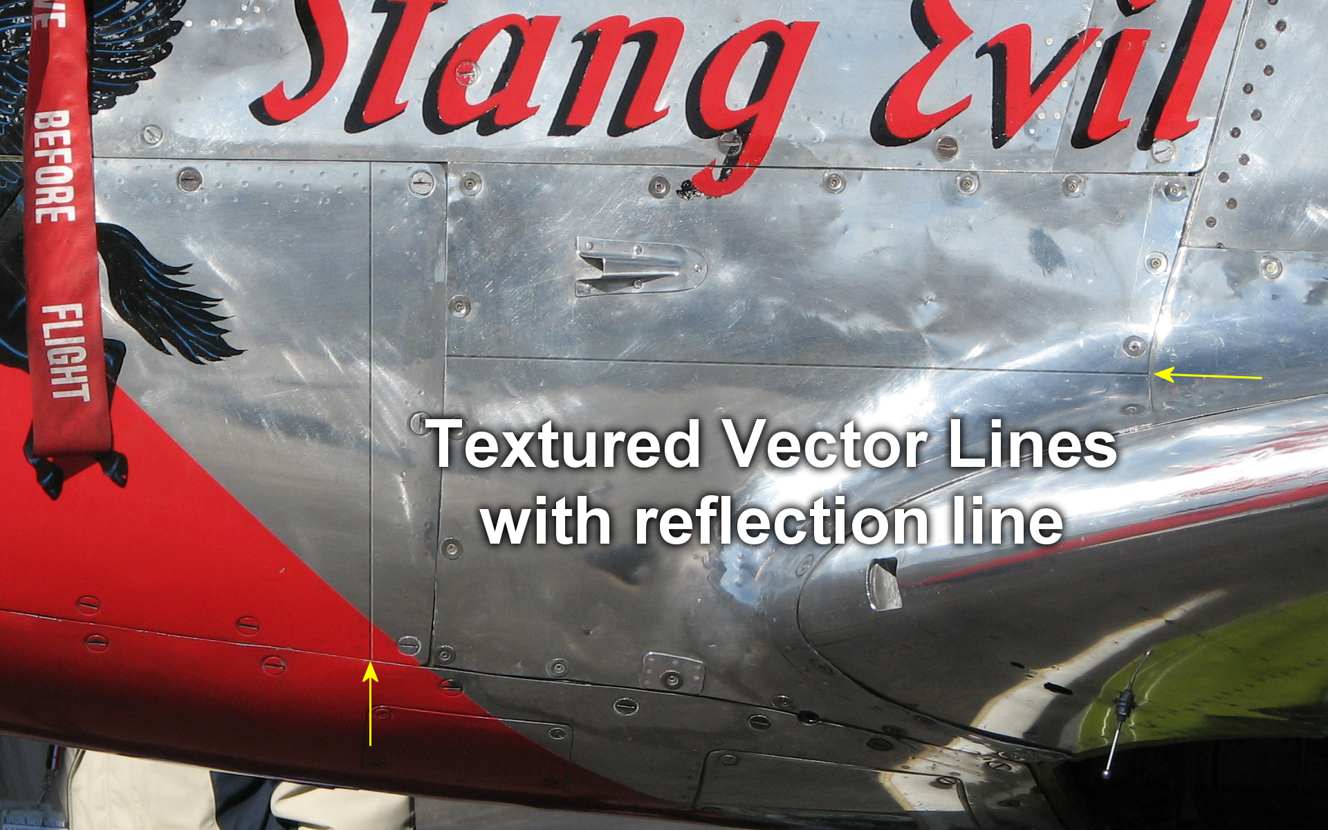
Now, there are two ways of creating more prominent lines and the reflection of light along panel edges. The best way is to ignore this in the 3D model's main texture files and let this task be handled by the bump map files where the light in FSX is controlled. The other way, as I'll show here, is to create the same effect with graphics. Some older aircraft models don't have bump map files, so you'll want to do what you can with raw graphics.
What I did in this final example was duplicate the layer with the black line to darken it. I then duplicated that layer again, changed the vector line to white, and offset it by 3 pixels - the width of the line. So without much time and effort I've created panels lines that look real good next to actual lines in the photo.
LESSON #4: Camouflage.
I'll say this straight up, camouflage patterns can be a royal pain in the fire exit! Working with different files that paint different parts of an aircraft, and getting them to line up correctly is not one of my favorite tasks. HOWEVER, there is hope. I came up with a method that greatly reduced my headaches, and I want to pass that onto you.
My method involves the use of "Vector Graphics", and layers. It is both complicated and simple.
Here is the basic list of steps:
1: Create the Vector layer with camo pattern lines.
2: Align those lines where different parts of the aircraft meet along wing roots, ailerons & flaps, tail feathers, etc.
3: Duplicate that Vector layer once everything is aligned and perfected.
4: Convert that duplicate layer to Raster graphics and TURN OFF the original Vector layer.
5: Blur the new duplicate Raster layer to your liking.
That list is as simplified as a TV Home Improvement show without all the behind-the-scenes bashing of knuckles and cussing. So I'll take each case in point and explain.
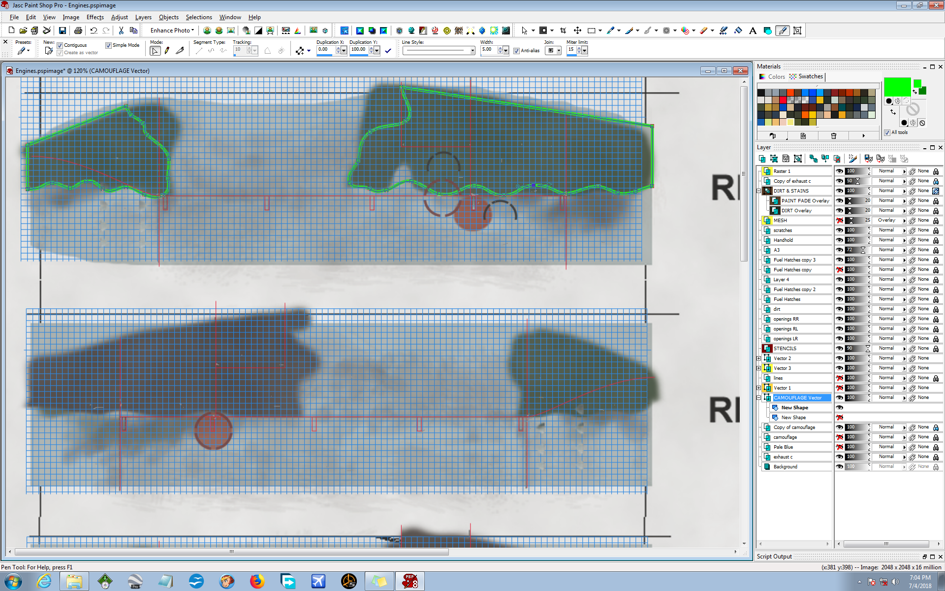
1: Create the vector layer with camo pattern lines. First, I create a Vector Layer for my Camo. Then I start laying down vectors real fast and imperfect. I just throw down some basic patterns that mimic the camouflage in a very basic fashion. I keep it simple and stupid - no detail work yet.
I throw down the most basic of Vectors. Hell, the proper colors don't even matter at this point. Sometimes I use obnoxious colors like red, magenta, cyan or nuclear green; just so they stick out and are easier to work with visually. The beauty of vectors is that their inputs can always be changed later (similar to layers). That is why I just throw down some basic vector lines at first, and worry about the details later. Let the benefits of vectors work FOR you here. Just throw that stuff down as best you can guess, then recreate the DDS file and check it out in FSX visually and see where things line up.
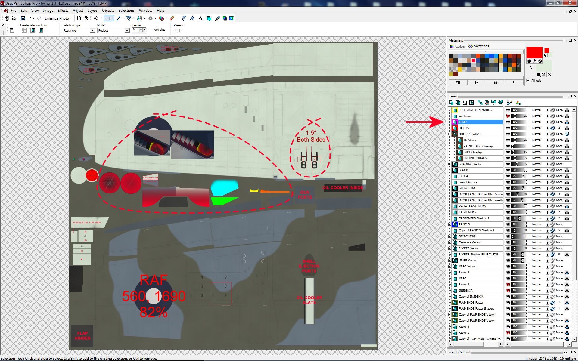
At this point I'm going to go back to the beginning of this tutorial and remind you about the use of "Temp Layers". Temporary layers are tools that you can use for yourself that never show up in the final product. A GRAPH is an often-used tool that I use when it comes to Temp Layers. When I am trying to line up different files that paint different parts of an aircraft, I find a graph to be very helpful. Let's take a look...
I am working on the Flight Replicas® Me-262 at the moment (one of the most beautiful aircraft ever created), and came across a situation that I want to take you along with me as I solve this issue. I took some screenies as I did my work.
I thought I was mostly done with this repaint when I discovered how screwed up the camouflage is on the engines - under the wings. It's just a total mess and I just can't let that slide. Not on MY personal ride! So the main problem for me is that I didn't know exactly what part of the file painted which area. This is the perfect time to show you how I use GRAPHS. A Graph is your best friend when you don't know what-paints-what, or how a 3D model might warp graphics.
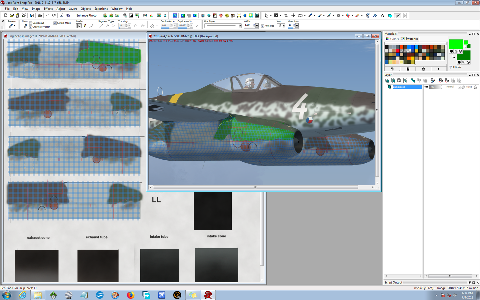
I layed down a Graph on a temporary layer, aligned it with some panel lines to give me a solid reference point; then I recreated the DDS file using my temporary graphics. The screenie shows where I aligned the graph on some panel lines, that I also changed to red so that I could see them better. (Maybe I didn't need to do that, but I have made it a habit to do such things in case it might help me.) I opened the DDS file for the engines with DTXBmp, painted the engines with my weird temporary graphics and took some screen shots.
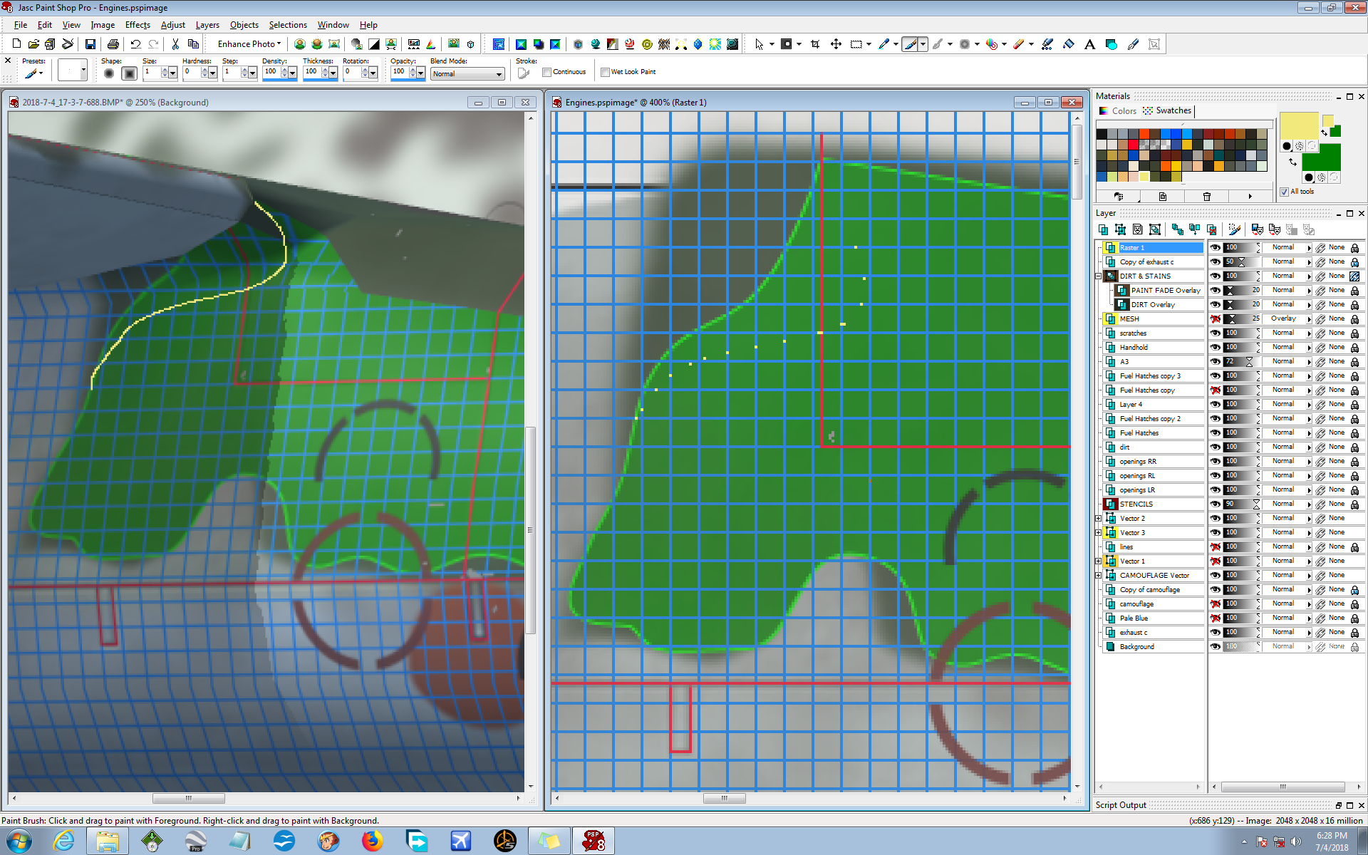
Now you can see what I'm talking about. The graph allows me to see EXACTLY what-area-paints-what-area. The graph does not lie! My assumptions and guessing will often lie, but the graph never does!
The first thing I did was to draw on the screen capture where I want the edge of the Camo to be (on the left), without any thought of the graph. I just draw where I want the Camo. After that, the graph comes into play. Once I have my hypothetical Camo line drawn, I go to the actual graphics file and just lay down some dots on a new Temporary Layer (on the right). (This is a VERY Temporary Layer! I'll delete this layer once my work is done here.)
I use the graph and lay down dots square-by-square and let the graph tell me where my temporary line intersects the boxes of the graph. It doesn't have to be perfect, and I will play around with it later once I get the technical crap out of the way.
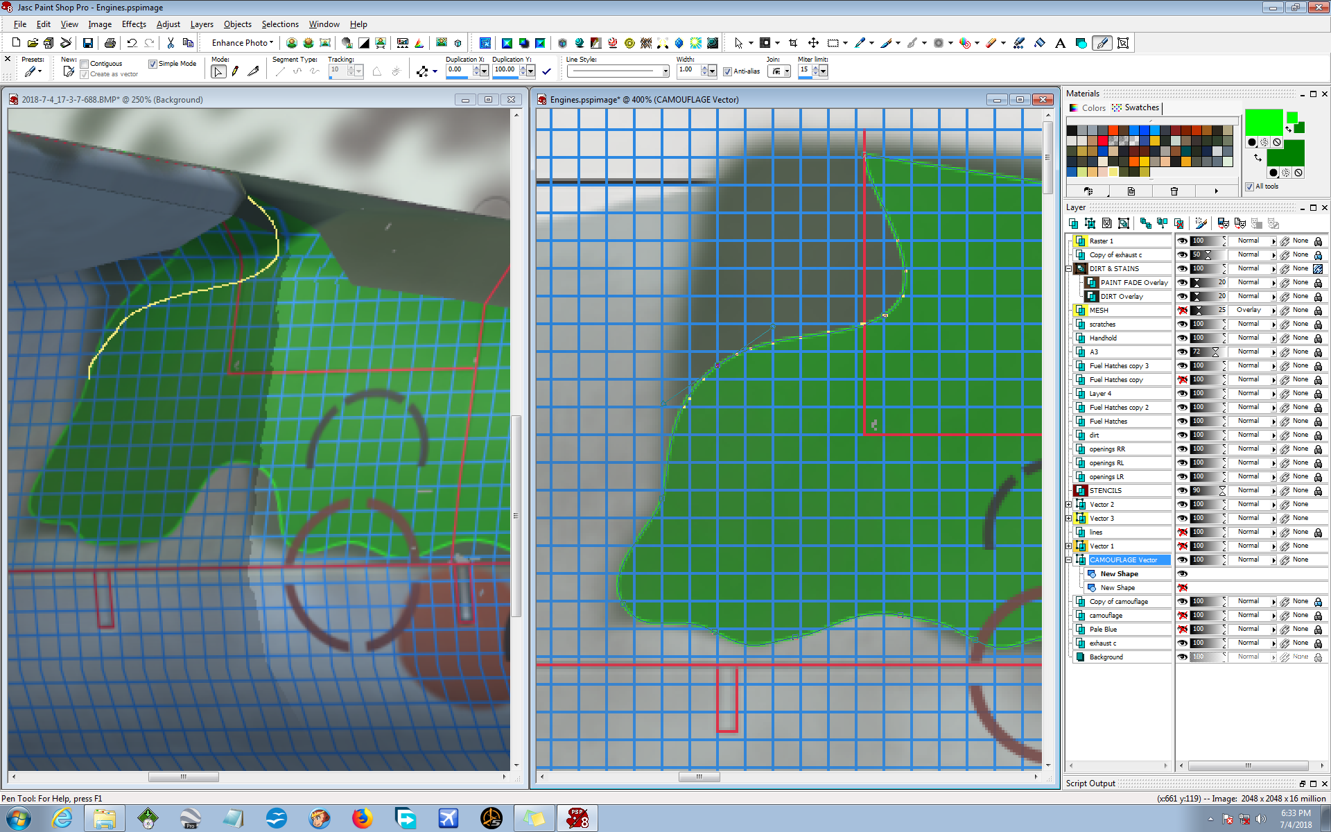
Now I create a Vector Graphics Layer that follows the trail of dots. It's quick and simple and I KNOW that it will be in the correct place because my graph buddy tells me so. If you look closely at this screen capture you will see the Vector line that follows the trail of dots. So now I will have a Vector camouflage layer that duplicates my yellow line that I manually drew on the screen capture. If that's not totally kickass I don't know what is! My work on this section of the plane is basically done, without trial-and-error and time wasted. I know it's in the proper place because the graph tells me so. If the 3D model had warped the graphics, the graph would have shown that.
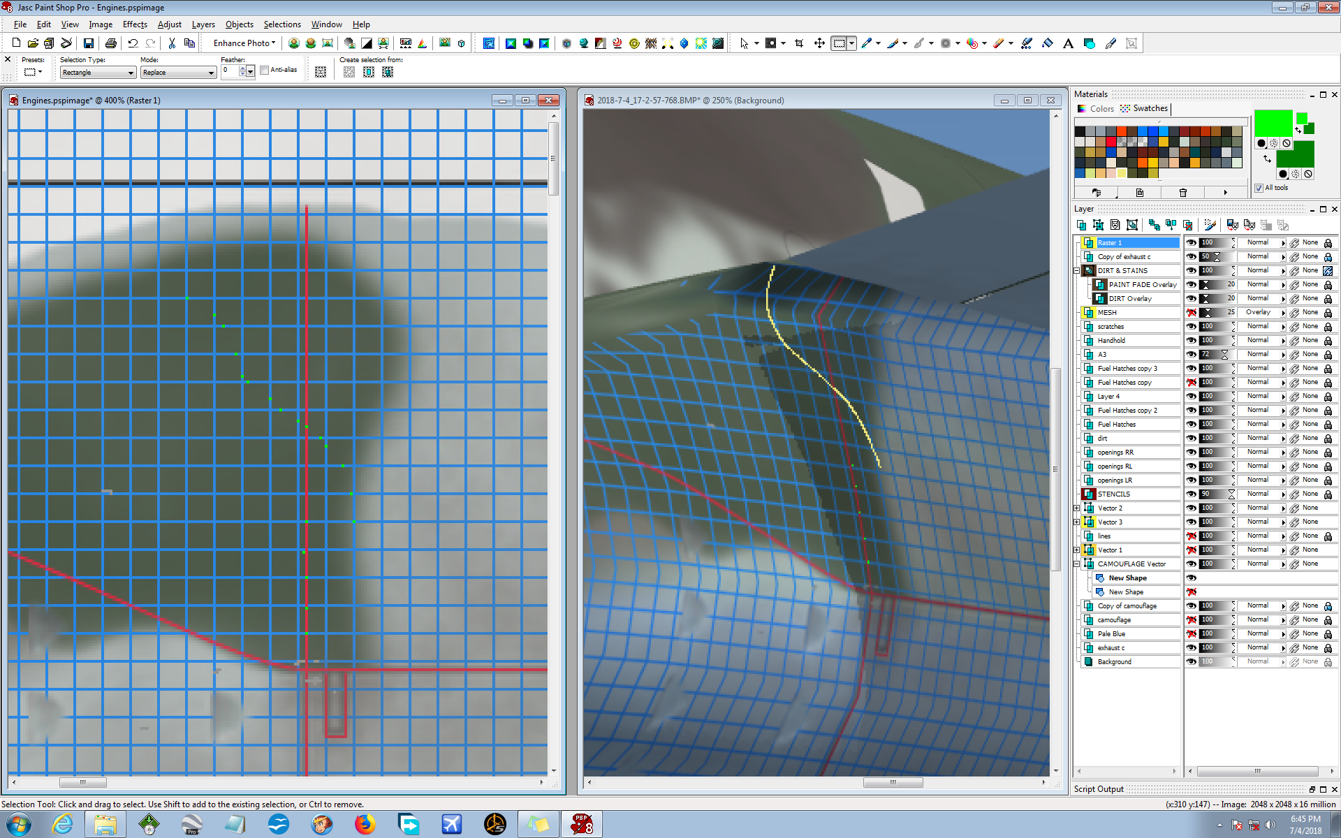
Well, crap, things were going fine until I worked on the ass-end of the same engine! This is where the 3D model warped the graphics, and I want to show you how the Almighty Graph reveals everything for us. This isn't an extreme case, but the graphics get stretched a bit at the wing-root. I used the same method as I did on the front end of the engine, but this time things got a little weird. I plotted my trail of dots, going by the graph, and after that the trail of dots didn't look right. Look at the trail of dots and how different it is to the drawn line. They are actually the same on the graph. Crazy but true...
But here's the thing - using the graph is like flying on instruments. A pilot may "feel" the horizon is in one place while the instruments may say otherwise. Follow your instruments! In this case, follow the graph!
So I ignore the fact that the trail of dots doesn't look right. I trust the graph and go on about my work. The method is solid and da graph don't lie! Flying by instruments I go on with my work and save a lot of time by ignoring my gut instincts. In this screenie I show my camo Vector Layer with exaggerated edge lines so you can see the final work, so far. I've played around with the vector points and modified the edge line to something I like better. After this I will do the usual procedure of changing the colors, duplicate the layer, turn OFF the ORIGINAL layer, promote the NEW to Raster graphics and blur it in order to mimmick sprayed paint.
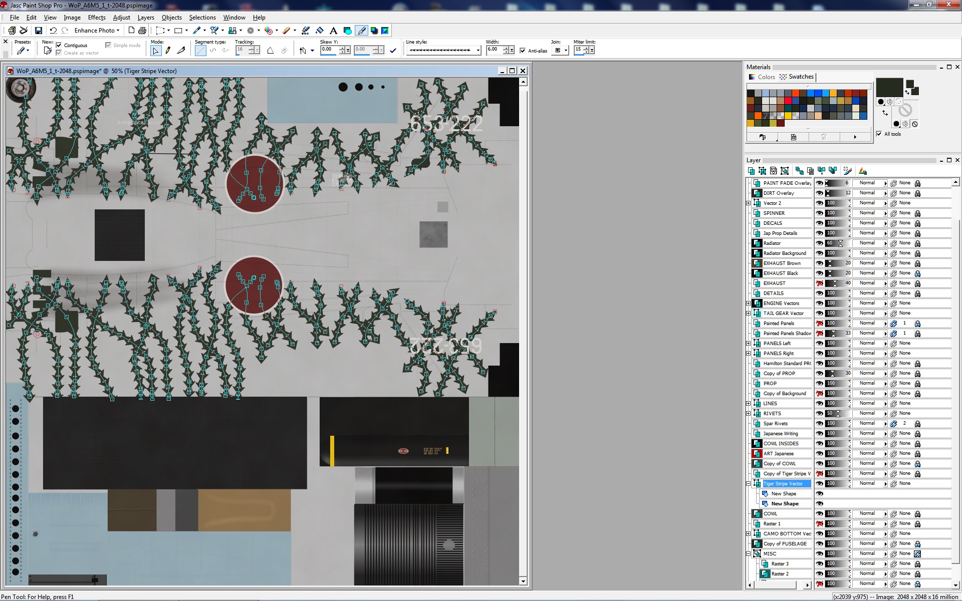
Here's an example of using some crazy Vector Lines to create tiger-stripes on the old A2A Shockwave Zero (which is still the best Zero model I know of, and it works in FSX, Acceleration). Sorry, I haven't uploaded my repaints for this Zero yet. Most don't have this FSX aircraft and I just don't have the drive that the amazing JCBLOM has. So anyway, I wanted to create tiger-stripes that weren't totally straight and smooth. So I found this crazy Vector Line pattern in PSP8 and tried it out. And it worked!
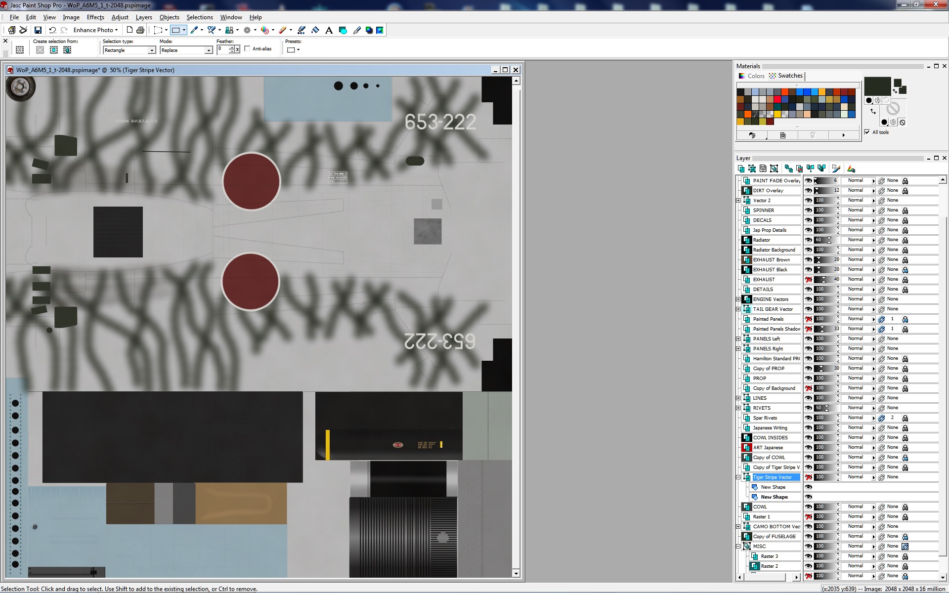
Same method I use for big camo patterns - I created a Vector layer, duplicated it, converted it to Raster graphics, then blurred the snot out of it. I liked the outcome and called it a good day.
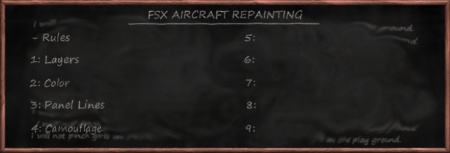
Like most of you, I have a LOT of hobbies outside the FSX world - hobbies, job, cars... yada, yada, yada. I have concocted this repainting tutorial as best I can at this time. Below you will see other subjects that I plan on tackling in the future, but YOU can affect the outcome. Don't hesitate to email me with your ideas, thoughts and questions. I created this page to help fellow repainters, and it is YOUR input that will help me to carry out that mission in the future.
As you probably noticed, the chalkboard up top is only halfway filled with topics. YOU can help me fill in the other half. Perhaps, I will put together some Youtube videos to show my methods, but at the moment I just don't have the time. This is a work-in-progress and I would very much like your input. The Flight Sim community is a wonderful bunch of people, from all around the world, men and women alike, and I have gotten so much from being in your world. So... Thank you.
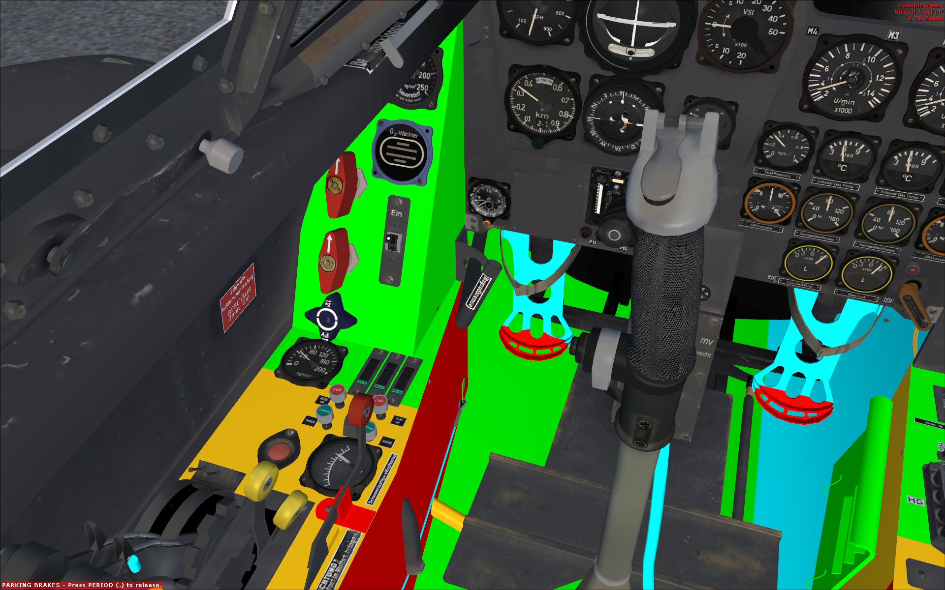
LESSON #5: Virtual Cockpits.
Xxxxxxxxxxxxxxxxxxxxxxxxxxxxxxxxxxxxxxxxxxxxxxxxxxxxxxxxxxxxxxxxxxxxxxxxxxxxxxxxxxxxxxxxxxxxxxxxxxxxxxxxxxxxxxxxxxxxxxxxxxxxxxxxxxxxxxxxxxxxxxxxxxxxxxxxxxxxxxxxxxxxxxxxxxxxxxxxxxxxxxxxxxxxxxxxxxxxx.
LESSON #6: File Format Options.
Xxxxxxxxxxxxxxxxxxxxxxxxxxxxxxxxxxxxxxxxxxxxxxxxxxxxxxxxxxxxxxxxxxxxxxxxxxxxxxxxxxxxxxxxxxxxxxxxxxxxxxxxxxxxxxxxxxxxxxxxxxxxxxxxxxxxxxxxxxxxxxxxxxxxxxxxxxxxxxxxxxxxxxxxxxxxxxxxxxxxxxxxxxxxxxxxxxxxx.
LESSON #7: Bumps & Specs.
Xxxxxxxxxxxxxxxxxxxxxxxxxxxxxxxxxxxxxxxxxxxxxxxxxxxxxxxxxxxxxxxxxxxxxxxxxxxxxxxxxxxxxxxxxxxxxxxxxxxxxxxxxxxxxxxxxxxxxxxxxxxxxxxxxxxxxxxxxxxxxxxxxxxxxxxxxxxxxxxxxxxxxxxxxxxxxxxxxxxxxxxxxxxxxxxxxxxxx.
LESSON #8: Picture Tubes.
Xxxxxxxxxxxxxxxxxxxxxxxxxxxxxxxxxxxxxxxxxxxxxxxxxxxxxxxxxxxxxxxxxxxxxxxxxxxxxxxxxxxxxxxxxxxxxxxxxxxxxxxxxxxxxxxxxxxxxxxxxxxxxxxxxxxxxxxxxxxxxxxxxxxxxxxxxxxxxxxxxxxxxxxxxxxxxxxxxxxxxxxxxxxxxxxxxxxxx.
LESSON #9: Aluminum.
Xxxxxxxxxxxxxxxxxxxxxxxxxxxxxxxxxxxxxxxxxxxxxxxxxxxxxxxxxxxxxxxxxxxxxxxxxxxxxxxxxxxxxxxxxxxxxxxxxxxxxxxxxxxxxxxxxxxxxxxxxxxxxxxxxxxxxxxxxxxxxxxxxxxxxxxxxxxxxxxxxxxxxxxxxxxxxxxxxxxxxxxxxxxxxxxxxxxxx.

Copyright © 2018 by Simulated Creations™. No material may be reproduced without written permission.